
Car Logos Through The Ages
Every badge on a hood carries its own timeline. What began as family crests and factory marks now lives on as modern symbols of identity, proving that even small details can define an entire generation of drivers.

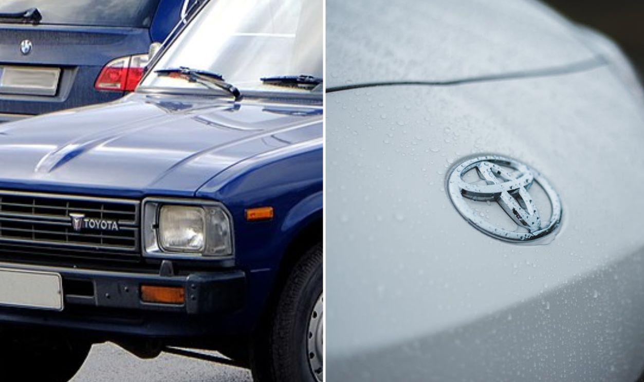
Toyota
The simple “Toyota” evolved into the world-famous trio of ovals in 1989. Within it, two inner shapes trace a subtle “T”, enclosed by a circle of unity. Sleeker and flatter today, the emblem remains instantly recognizable worldwide.
 Tommi Nummelin, Wikimedia Commons and Erik Mclean, Pexels
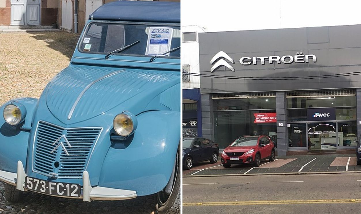
Citroen
Andre Citroen’s legacy began with a pair of upward chevrons inspired by gear teeth. Early versions looked mechanical and bold, but recent updates simplified the double chevrons into a flat, silver design—modern and unmistakably tied to the brand’s industrial roots.
 Krzysztof Golik and Fma12, Wikimedia Commons
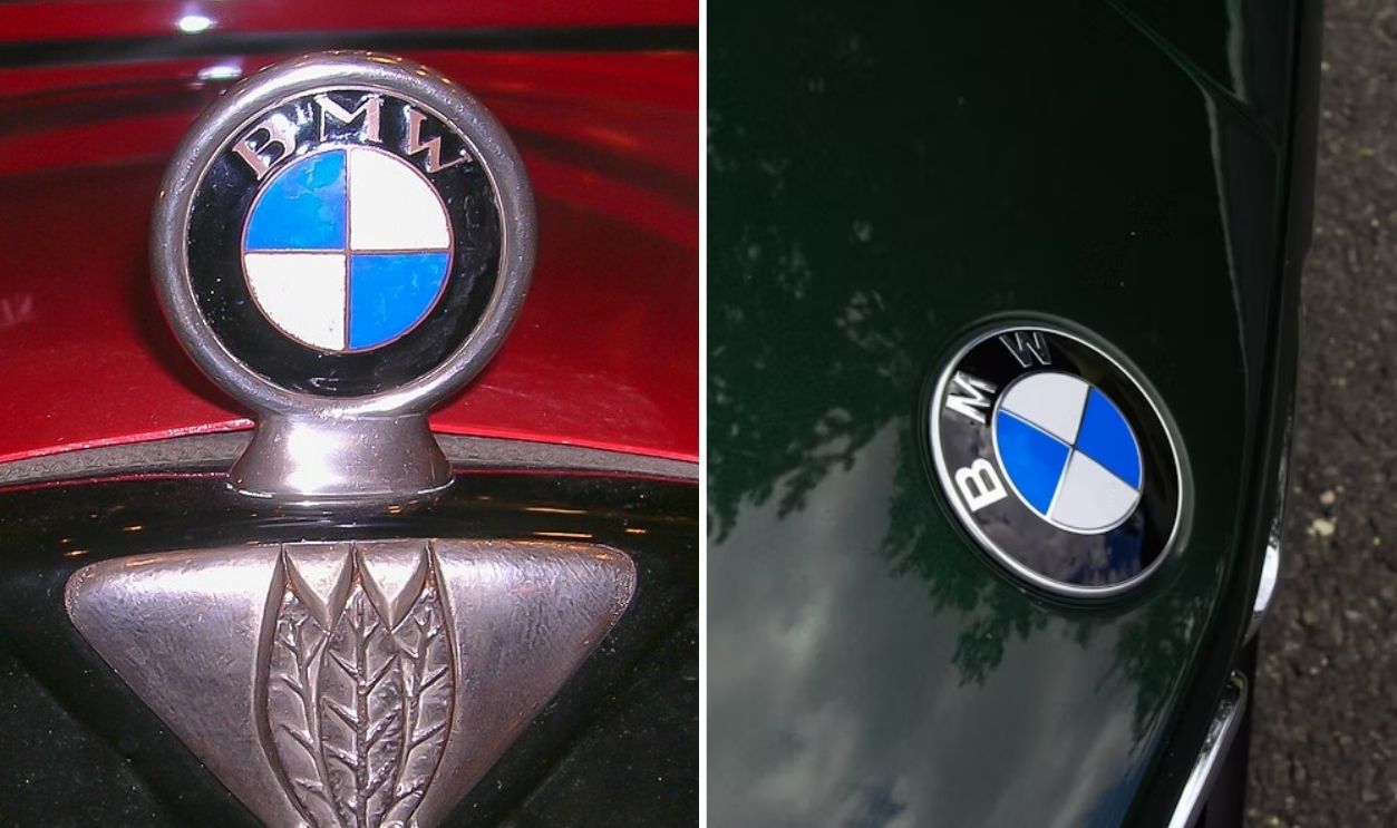
BMW
BMW’s roundel dates back to 1917, inspired by Bavaria’s blue and white colors. The 2020 redesign removed the black ring and added transparency to create a lighter, digital-friendly look that keeps its century-old identity intact.
 DeFacto, Wikimedia Commons and Shayan Godarzi, Unsplash
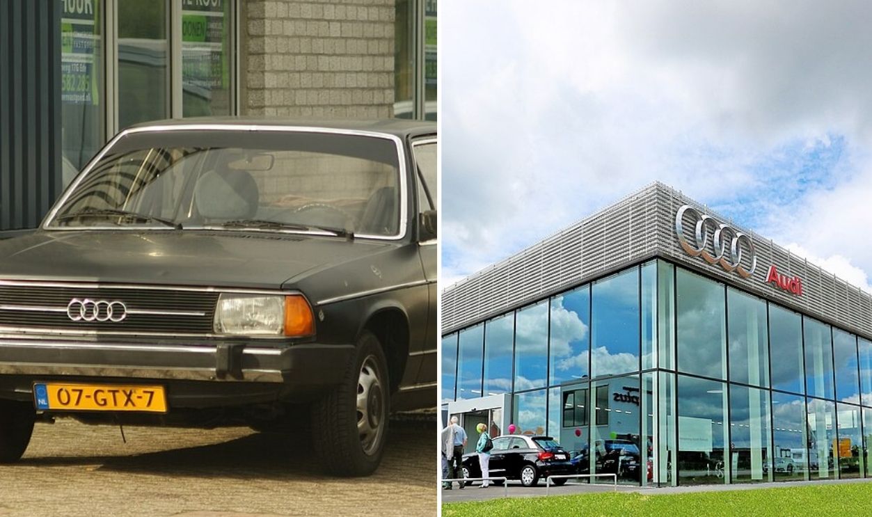
Audi
Today’s Audi emblem is four interlocking chrome rings, but a century ago, those rings symbolized four merging automakers: Audi, DKW, Horch, and Wanderer. Sleek branding now hides a story of industrial unity.
 Niels de Wit from Lunteren, The Netherlands and Marketing.fgg, Wikimedia Commons
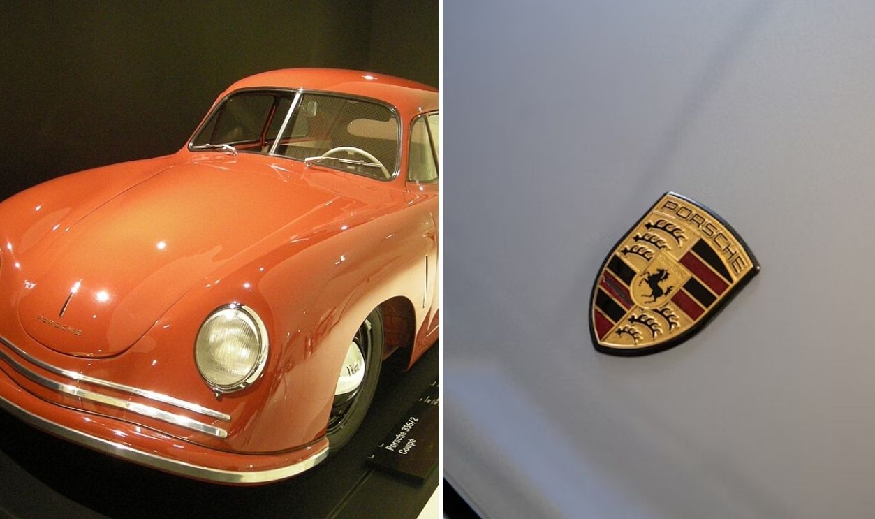
Porsche
Before the golden crest gleamed on every hood, Porsche’s emblem began in 1952 with a horse from Stuttgart’s coat of arms and antlers from Württemberg’s shield. The 2023 redesign sharpened its lines and deepened its tones to preserve heritage through precision.
 Michael Barera, Wikimedia Commons and Christian Tan, Unsplash
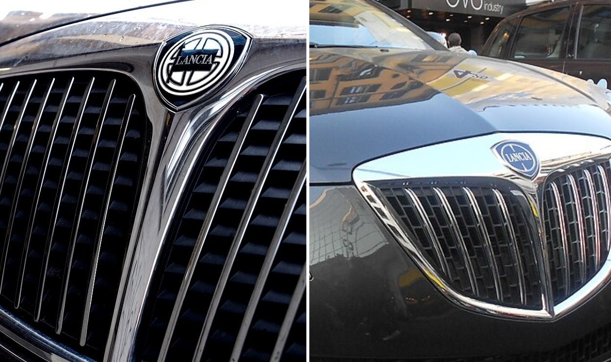
Lancia
Few emblems show reinvention like Lancia’s. Its 2022 badge, marked by flat silver lines and a deep blue center, replaces the 1920s design of a spear and flag. What once symbolized racing pride now reflects a quieter, high-tech Italian identity.
 Petar Milosevic and Pava, Wikimedia Commons
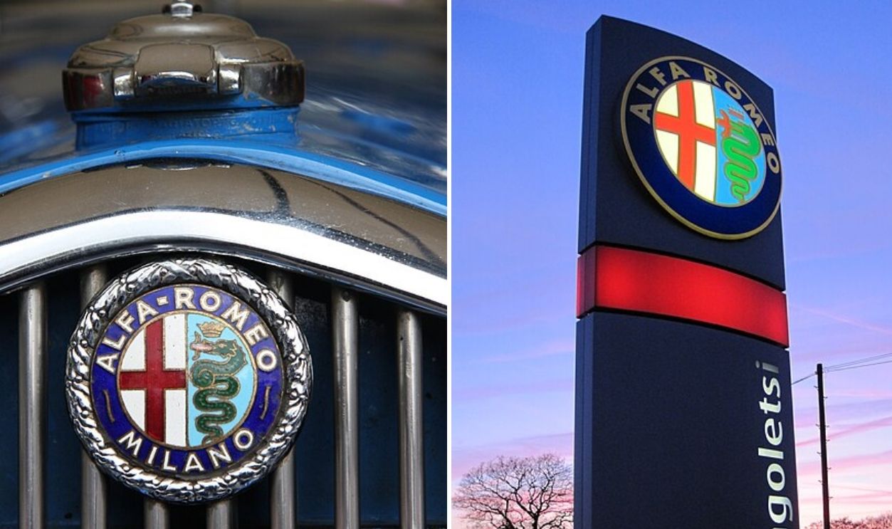
Alfa Romeo
Milan’s red cross and serpent have anchored Alfa Romeo’s emblem for more than a century. Early versions glimmered with gold borders and elaborate shapes, while the current badge simplifies every detail to balance heritage with the precision of modern automotive design.
 Brian Snelson and KillianRoche, Wikimedia Commons
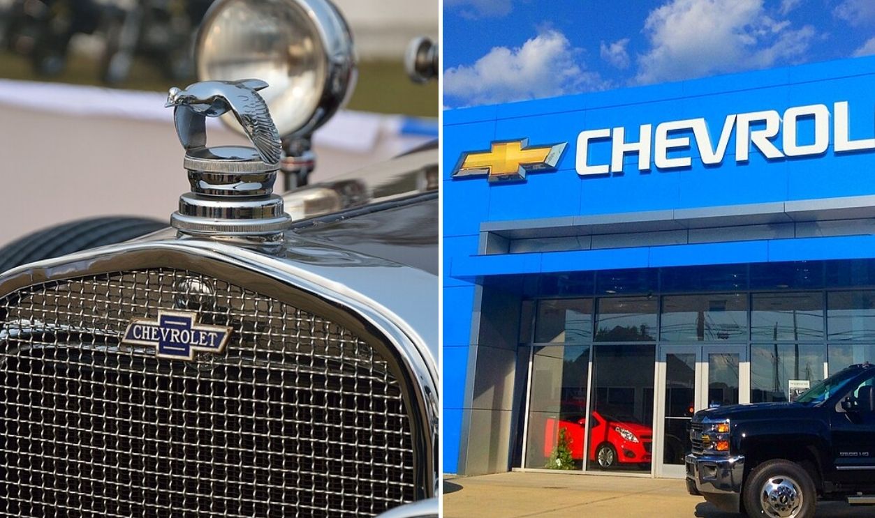
Chevrolet
Wallpaper in a Paris hotel may have inspired Chevrolet’s “bowtie” in 1913, according to co-founder William Durant. The earliest design gleamed with gold and intricate texture, while today’s streamlined badge relies on symmetry and metallic depth to convey strength without excess.
 Biswarup Ganguly and Mike Mozart, Wikimedia Commons
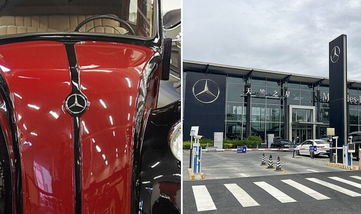
Mercedes-Benz
Few emblems rival Mercedes-Benz’s star for longevity. Patented in 1909 to symbolize mastery of land, sea, and air, it later gained a circle that unified its image. Today’s flat silver design keeps that century-old intent while aligning with new age designs.
 Alf van Beem and N509FZ, Wikimedia Commons
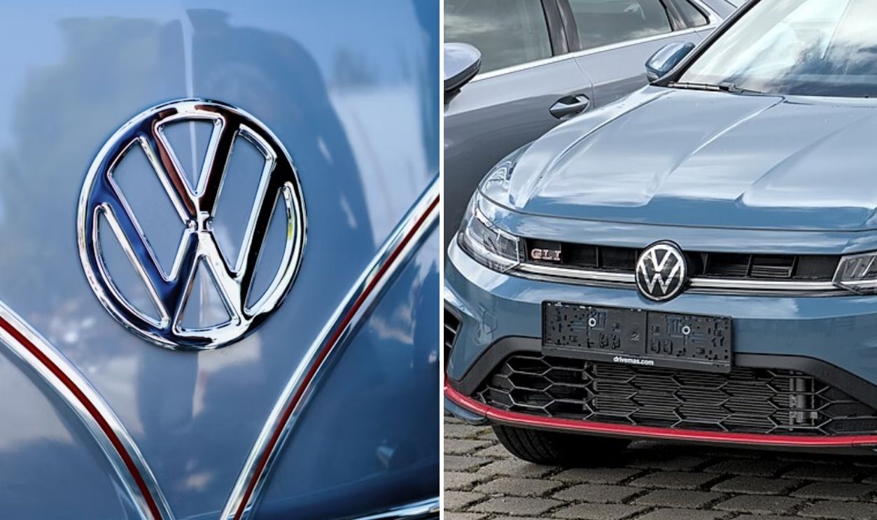
Volkswagen
When the VW logo first appeared in 1937, it was surrounded by cog-like teeth—a mechanical nod to Germany’s new industry. Decades later, it’s gone fully flat: two simple letters inside a blue circle, engineered for minimalism and digital brilliance.
 Jason Leung, Unsplash and Alexander Migl, Wikimedia Commons
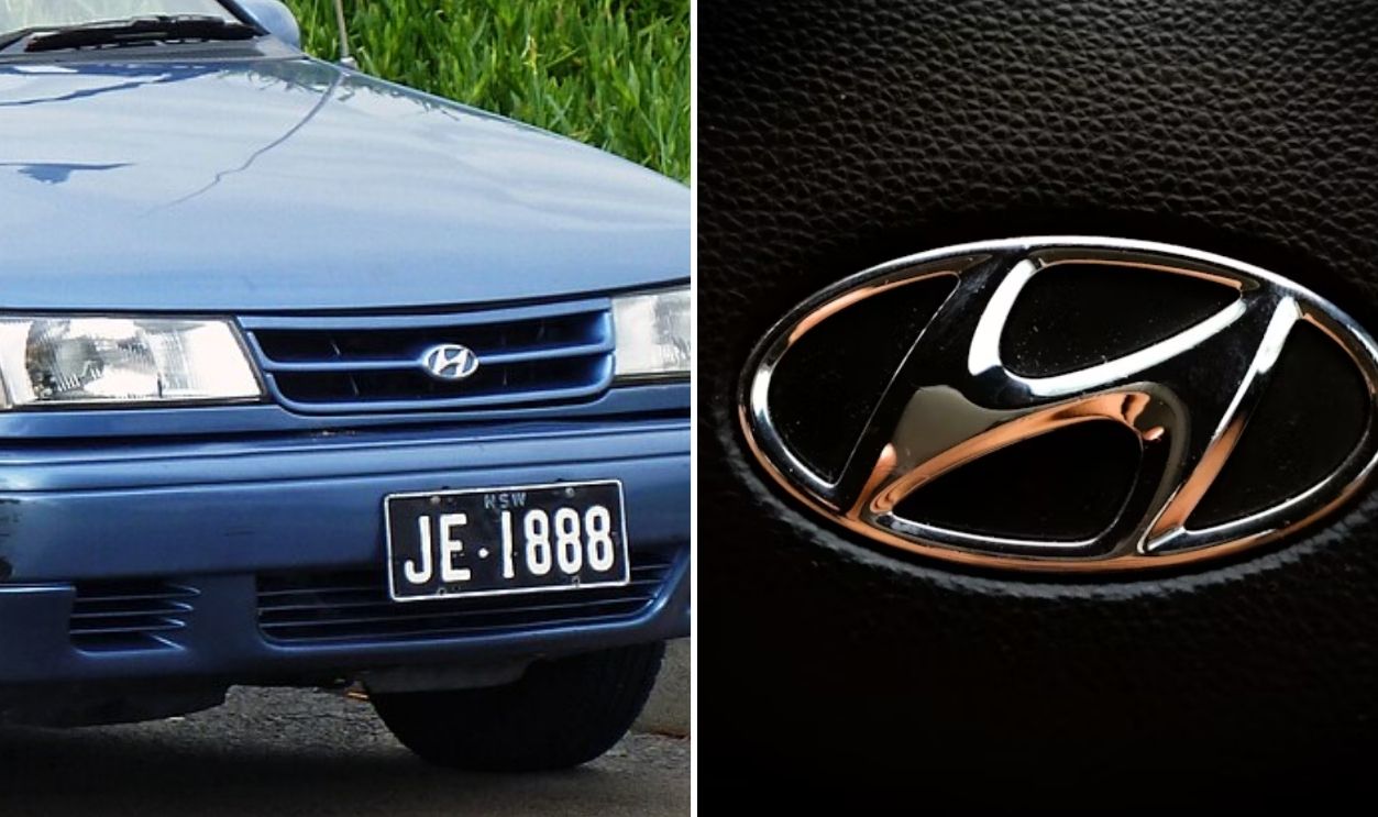
Hyundai
The current Hyundai “H” looks simple, but it’s more than a letter. It’s a handshake between the company and the customer. Earlier versions used an oval shield and metallic depth. Now, flat silver takes over, designed for trust along with global readability.
 OSX, Wikimedia Commons and @named_ aashutosh, Unsplash
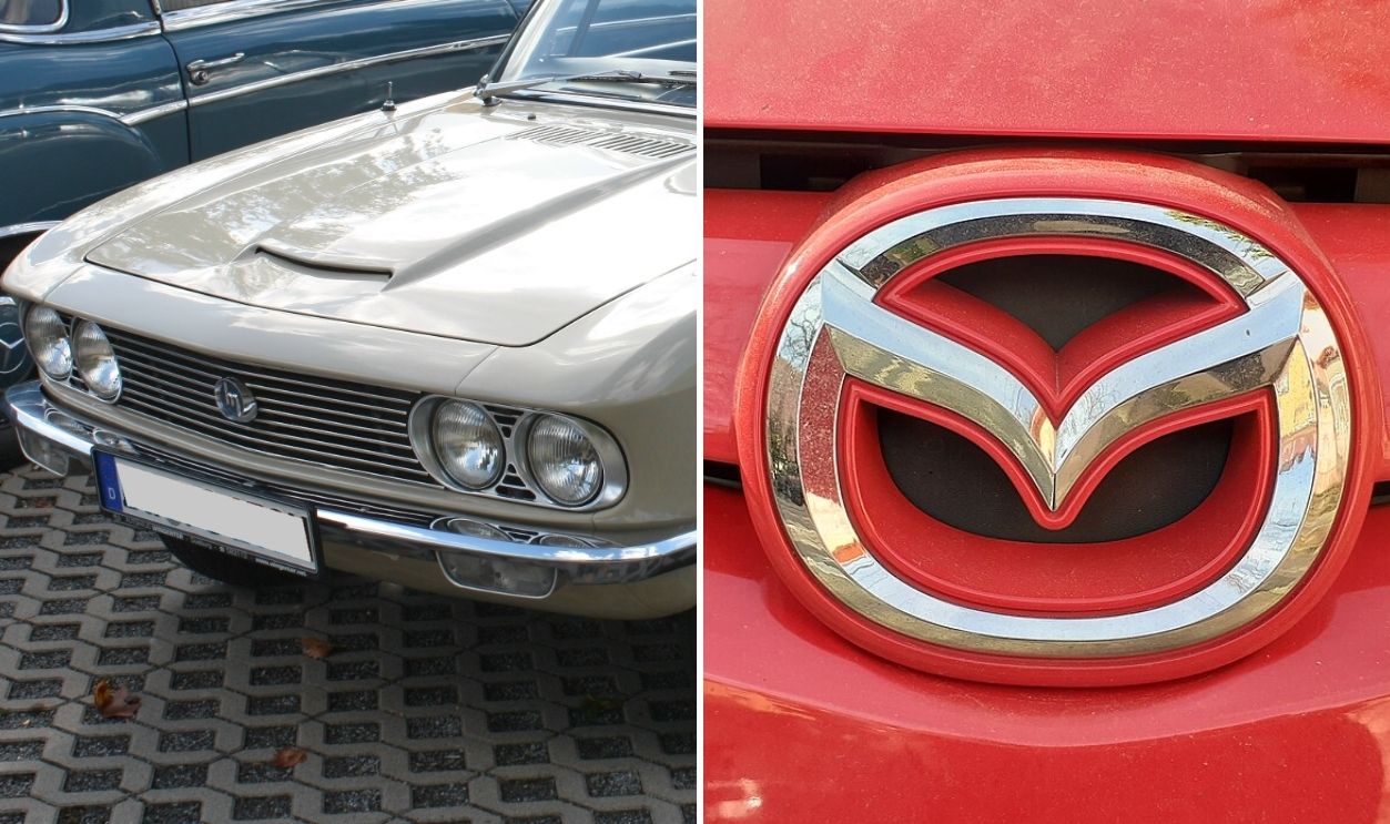
Mazda
Mazda’s emblem has reinvented itself as often as its cars. The latest wings, formed in a flatter silver “M”, represent flight and freedom. Early versions were rigid and geometric, a far cry from today’s flowing, almost meditative sense of motion.
 Detectandpreserve and ГП, Wikimedia Commons
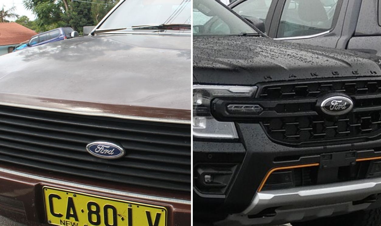
Ford
Ford’s emblem began as a detailed industrial badge, later evolving into the clean blue oval we know today. Though the ornate borders disappeared, the iconic cursive script introduced over a century ago stayed. It’s minimal, instantly recognizable, and digitally perfect.
 Jeremy and Harvey Bold, Wikimedia Commons
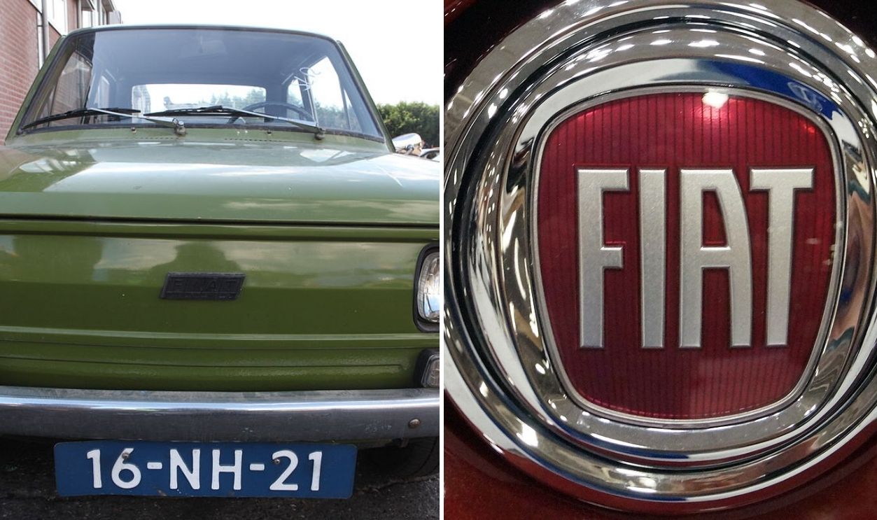
FIAT
Today’s FIAT badge gleams in deep red chrome, modern yet proudly Italian. But rewind to 1899, and the logo was a blocky blue plaque reading “Fabbrica Italiana Automobili Torino”. The shine changed over decades, but the city’s spirit never left.
 Joost J. Bakker and Greg Gjerdingen, Wikimedia Commons
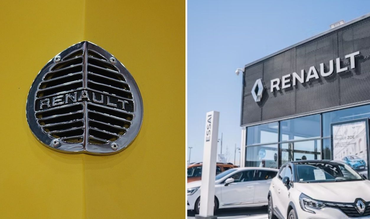
Renault
Once resembling a rugged metal grille, Renault’s early emblem mirrored the industrial France of its time. A century later, sleek parallel lines reshape the famous diamond—flattened, futuristic, and ready for a digital era that values precision over power.
 Janos Tamas, Wikimedia Commons and Sebastien Chiron, Unsplash
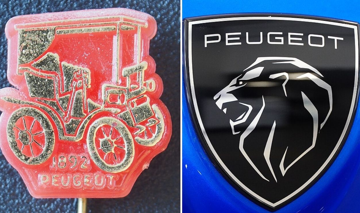
Peugeot
Peugeot’s lion has shed its mane more than once. What began in 1858 as a full-bodied predator now stares forward from a minimalist black shield. Each evolution sharpened its expression, refining French pride into sleek, unmistakable strength.
 Alf van Beem and A.BourgeoisP, Wikimedia Commons
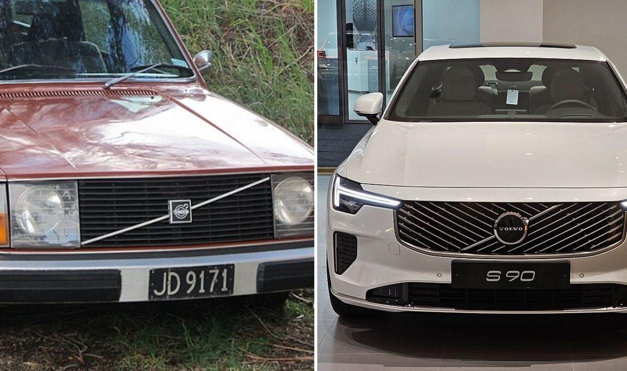
Volvo
Before modern screens and electric models, Volvo’s badge gleamed in chrome with its circle and arrow carved deep like forged iron. Its newest look keeps that ancient symbol intact but trades metallic shine for flat design and calm Scandinavian minimalism.
 Riley and Damian B Oh, Wikimedia Commons
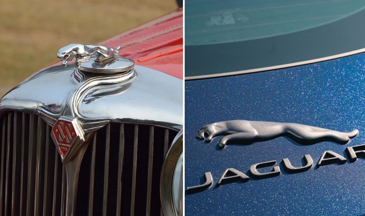
Jaguar
That leaping cat you once saw? It was a fierce, three-dimensional hood ornament lunging off the bonnet. Modern Jaguars use a minimalist circular badge, less literal but equally powerful, a predator reimagined for the age of electric luxury.
 Biswarup Ganguly, Wikimedia Commons and Taylor Beach, Unsplash
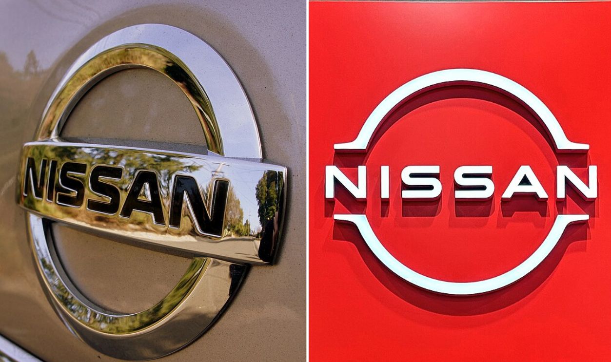
Nissan
Nissan’s first badge from 1933 proudly showcased Japan’s rising sun in red over a blue rectangle. By 2020, those bright colors were gone—replaced by a slim, metallic outline that suits the brand’s electrified future and minimalist aesthetic.
 Michael Sheehan And Tokumeigakarinoaoshima, Wikimedia Commons
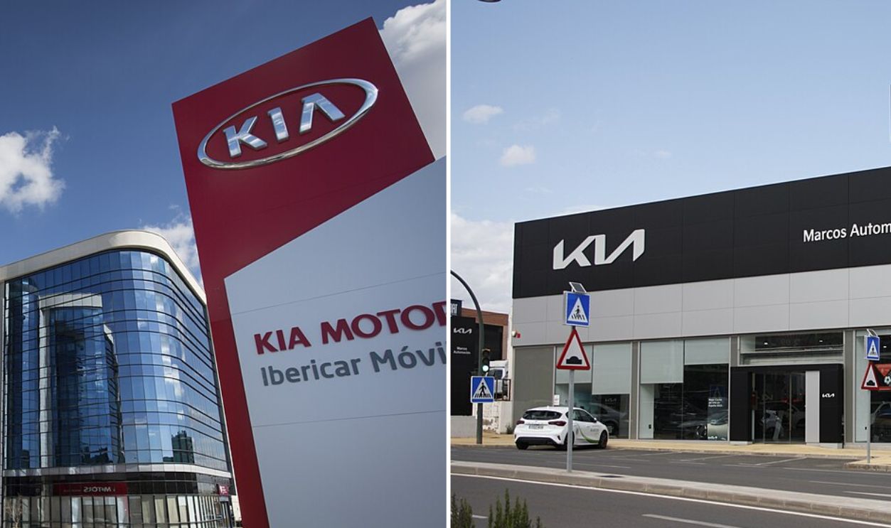
Kia
Back in the 1950s, Kia’s emblem was boxed inside a rigid hexagon, which was functional, just not memorable. Its 2021 redesign flips that entirely by connecting each letter in one sleek motion that feels futuristic and confident in its own global momentum.
 Ibericar and Schumi4ever, Wikimedia Commons
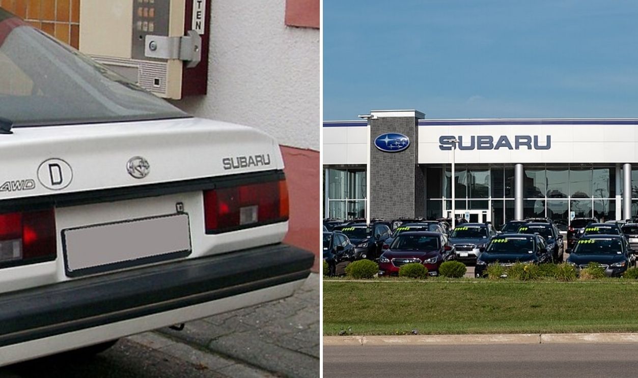
Subaru
Today’s Subaru badge shines with six chrome stars on a deep blue oval—Japan’s Pleiades constellation made corporate. But the original 1950s emblem was boxier, flat silver, and without sparkle. The meaning, unity of six merged companies, has never faded.
 Rudolf Stricker and Joseph Gage, Wikimedia Commons
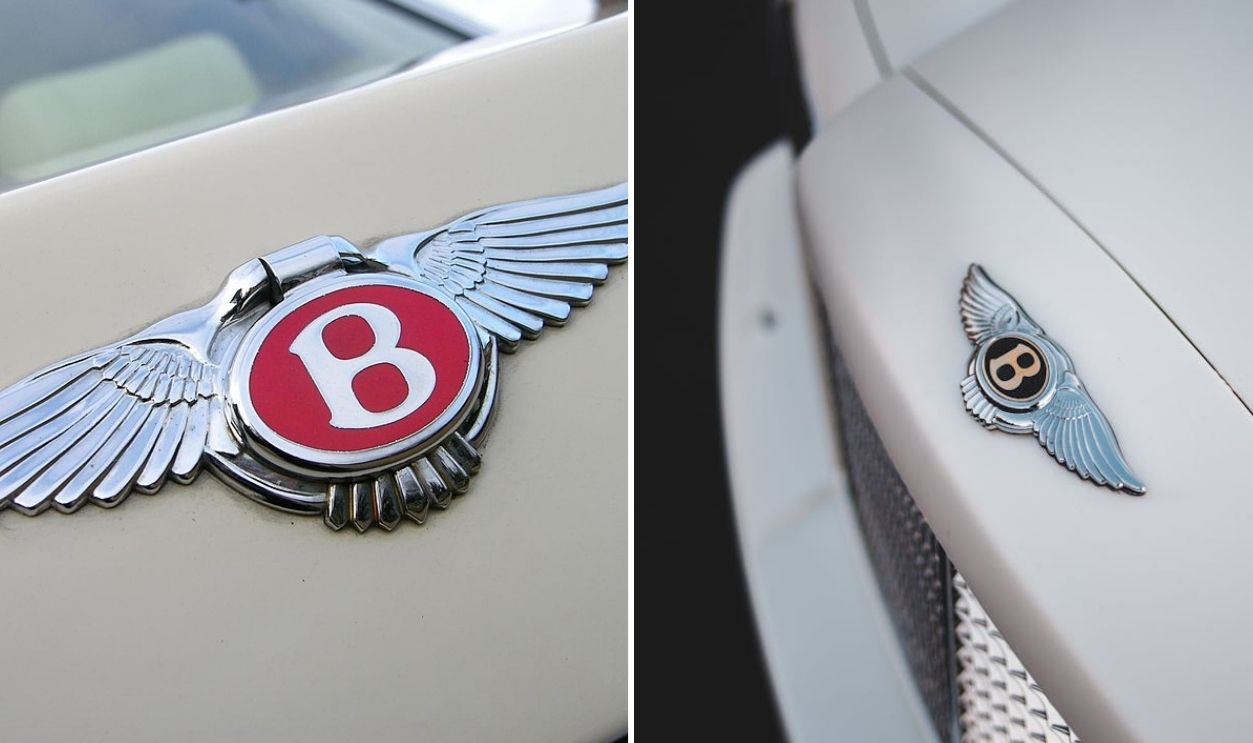
Bentley
Early Bentley emblems looked like something from aviation’s dawn, a green “B” with stretched metal wings celebrating speed and freedom. Now, the badge gleams in refined silver, its feathers symmetrical and minimal.
 The Car Spy, Wikimedia Commons and Erik Mclean, Pexels
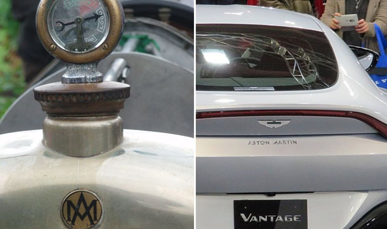
Aston Martin
New Aston Martin wings are sleeker and stripped of color, pure white and silver confidence. Back in the 1920s, the logo bore Art Deco lines and bold text. Over time, flamboyance gave way to precision, mirroring the cars themselves.
 Akela NDE and Tokumeigakarinoaoshima, Wikimedia Commons
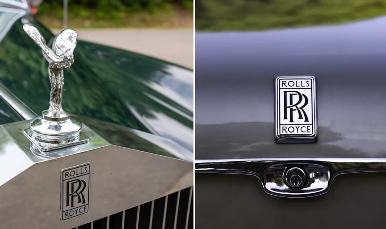
Rolls-Royce
Before it became a study in understatement, Rolls-Royce’s double “R” badge gleamed in bright red enamel. Now it’s black and chrome, paired with the Spirit of Ecstasy figurine—luxury redefined through subtlety rather than shine.
 Jainath Ponnala and Amit Lahav, Unsplash
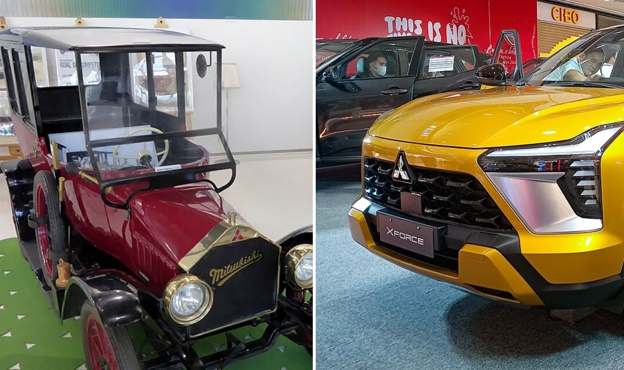
Mitsubishi
Mitsubishi’s famous three-diamond mark barely changed, but its presentation did. Today it’s flat and bright, tailored for digital clarity. The original 1914 version appeared engraved on black, a merger of two feudal family crests—one of water chestnuts, one of oak leaves.
 Tokumeigakarinoaoshima and Ethan Llamas, Wikimedia Commons


.jpg)
,_26hp,_1300cc,80kmh_pic2.JPG)
_LS_5-door_hatchback_03.jpg)
.jpg)